Monday, December 15, 2014
Friday, October 31, 2014
http://artstyleonline.com/wp-content/uploads/2011/11/Face-house.jpg
I don't even know the face this house is making..
Wednesday, October 29, 2014
Emotion is color
Black represents elegance in this picture. Her wearing the black dress makes her look more elegant.
Blue in this picture represents confidence. This girl dyed her hair blue, which is a pretty bold thing to do since it stands out among others. Yet she smiles knowing she's showing how confident she is.
Green in this picture represents freshness. The grass looks awesome and almost like it was untouched.
Orange in this picture represents restful feeling. Here in this tropical area, you have that peace feeling.
Purple in this picture represents power. This woman is (obviously) royalty, due to her stance and sporting off purple in her crown and cape. You could see in her face that she's all about wealth and power.
White in this picture represents innocence and purity. The pope here is wearing all white, which is the best color to use for a man of that job.
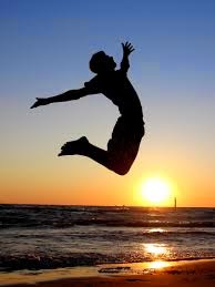
Yellow in this picture represents joy. The man is jumping for joy, and the yellow sun is reflecting off of him.
Monday, October 27, 2014
The Importance of Emotion in Design
http://thenextweb.com/dd/2014/02/25/importance-emotion-design/ This is a link to an article that talks about the importance of emotion in a design.
1.) The design will touch the observer when its visually appealing, enjoyable, reminds them of past memories, and gets a bit personal. Personal in a way where it makes them reflect on their personality.
2.) The elements that make a good Web Design are first impressions, accessibility, and cost of it. If you website looks terrible and have bad photos, the observer would obviously leave. Make it easy to go place to place in a website will get you big points since they;re on your website to finish a specific task.
3.)It is extremely relevant because it shows how much emotion a designer could put into his/her work. The more emotionally attractive a design is, the more the designer is praised at doing so.
4.) Yes I do agree. I'm not sure if we gave these colors emotion, or they've always represented it. Colors make us think and we apply it to our daily lives. Red is almost always associated with anger, but also love. Blue is always represented as sadness, but also a calm nature.
Wednesday, October 15, 2014
1)Attaching paint effects to curves
http://www.lynda.com/Maya-tutorials/Attaching-paint-effects-curves/137899/148408-4.html
2)
3)
http://www.lynda.com/Maya-tutorials/Attaching-paint-effects-curves/137899/148408-4.html
2)
3)
4) (Couldnt find anyone...)
5) "RalliSport Challenge has gone on to be a best selling game that still ranks as one of the Xbox console's most popular titles. And based on the success of the RalliSport team, DICE has switched its entire studio over to Maya."
6) A website that is a digital academy. It claims to take you to a course that, "The 5-day courses for kids and teenagers can be taken individually or combined for multi-week certifications at prestigious college and university campuses that includes University of Chicago, Stanford University (San Francisco area), Harvard (Boston), George Washington U. (Washington, D.C.), University of California – Los Angeles (UCLA), UC San Diego, UC Berkeley and more."
Monday, October 13, 2014
http://cgi.tutsplus.com/tutorials/designing-and-animating-a-birch-tree-in-maya-using-paint-effects--cg-21473
This awesome tutorial shows you how to make a Birch Tree with paint effects!
Friday, October 10, 2014
I wasn't able to watch a video on how to do this due to school blocking YouTube. I made this ocean with typed instructions. The instructions were very simple and I had no trouble finding what was instructed. The only problem I had was looking for a .AVI file but it wasn't within the computer. Pretty good result for a JPEG image.
Friday, September 5, 2014
Music Tech Thoughts
Part II. Write a multi-paragraph entry in which you discuss the following, in detail:
- How long have you been in the course?
- How clear has the material we've covered been?
- Is the subject interesting to you personally? Why or why not? (if not, how could it be better?)
- What would you like to gain from this class by the end of the year?
I've been in this course for about 1 year. I took Web design last year and learned how to do basic things such as vector art and posters. Now I'm in this Hybrid class, which is very cool and a skill-strainer. I was decent with Web Design so I'm trying my best for Music Tech. I understand everything as long as I'm paying attention. Classes like these are very, very precise. The reason why is that everything you learn ties together, so if i miss part on a lecture, i will most likely be lost. I was able to do all the work that was given, at my own pace. I honestly like this class because it teaches me so much about designing. I like art and everything and wish to make my own. I am a very terrible artist, so making things digitally makes things alot easier. We are slowly learning how to make animations and cities, but the time and effort will all be worth it when I master the basics.
I will gain a ton of knowledge on how to design. When I first started design, all the different programs and modes made it seem like it was impossible. After a few days of trying, I got the hang of it, and it didn't see it as difficult anymore. If I continue learning, ill one day help others learn how to make designs on a computer
Simplified City
This is the city I made with the Maya program. This city only consists of cylinders, cones, rectangles, and spheres.
Subscribe to:
Comments (Atom)


